
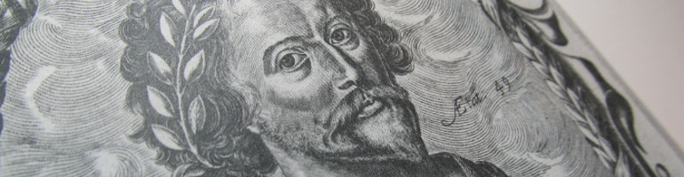
THE POEMS OF JOHN FLETCHER 1579 – 1625
Selected, edited and with a preface by John Tremayne.The Stella Press, 2015.Printed and bound by The Fine Press Book Bindery, Finedon, Great Britain in a limited edition of 150 numbered copies. Super Octavo (197mm x 270mm), 113 pages, sewn. Typeset in Berthold Bodoni Old Face. Printed on Logan Book Wove 150gsm soft white acid-free paper made by Fedrigoni in Verona. Bound in quarter dark-blue Dubletta 3253 cloth and Tiziano Terra di Siena paper sides. Title-plate engraved by Paul Kershaw, printed in two shades of blue and set into front cover. Spine-label printed letterpress on matching Terra di Siena paper. Dark blue Merida Indigo endpapers. Engraved frontispiece-portrait of John Fletcher by William Marshall (1647).
Price: £ 35.00, Euro 50.00.

THE IMAGE OF CALABRIA IN ENGLISH LITERATURE
Too impenetrable, too inhospitable, too dangerous, too remote, Calabria remained unabsorbed into the route that well-connected English tourists, with their entourage of tutors, virtuosi, servants and assorted hangers-on, followed through the peninsula from the seventeenth century down to the Napoleonic wars. Yet some more adventurous English travellers had penetrated thither in Tudor times, as did the future translator of Castiglione’s Il Libro del Cortegiano, Thomas Hoby in 1549. A later traveller, George Sandys, Anglican poet and translator, wrote bluntly of Calabria’s twofold threat: brigands from within, Turks from without (1610). Both threats, plus the added one of earthquakes, would recur in the gothic fiction of the following century, as in Charlotte Smith’s Montalbert (1795). Calabria, indeed, ideally fulfilled the great object of the gothic novel, which was to have the heroine bundled aboard a coach and four and abducted to some remote and impervious region. Already recognized by the father of the English gothic novel, Horace Walpole (The Castle of Otranto, 1768), this gothic image of Calabria was elaborated by writers who hadn’t been there. Yet some of its constituent elements were corroborated by actual travel to the region: ‘Mrs Radcliffe and Salvator Rosa – costumes and character, – horrors and magnificence without end’: so wrote Edward Lear in 1852, epitomizing the image of Calabria. His journey through the region was to be abruptly terminated by political turmoil, in the wake of which all the ills of modern Calabria grew. After Lear came the two great post-Risorgimento English descriptions of Calabria, those of George Gissing and Norman Douglas; they are in some sense antithetical. The book ends with a long appendix comprising two descriptions of the 1783 earthquakes in Calabria: Sir William Hamilton and Richard Keppel Craven.
![]()
The Image of Calabria in English Literature is an 85-page large octavo book (197 x 270 mm). It has been typeset in Günter Gerhard Lange’s Whittingham, a typeface based on founts used by the Chiswick Press around 1840 and released by the Berthold type foundry in 2000. The printing and binding is by the Fine Press Bindery in Finedon, Great Britain. It is printed on superior paper (Logan Book Wove 150gsm Soft White acid-free paper made by Fedrigoni in Verona). The binding is in quarter maroon Dubletta cloth with blue William Morris willow-bough patterned boards. The book is sewn. It is printed in an edition limited to fifty numbered copies.
Price: £ 35.00, Euro 50.00.
__________________________
THE STELLA PRESS published two new books in 2017-2018:
John Hayward: Elizabethan Historian 1564? – 1627. On the History of the English Nation and other Prose.

Edited and with an introduction by Peter Spring. This selection of Hayward’s prose in a number of genres – historiographical, political, military, biographical, confessional – is based on the first editions, and complemented with a checklist of John Hayward’s publications.
The first civil historian in England to write preferentially and exclusively in English, Hayward may not have founded the tradition of vernacular history in England, but he more than anyone helped to consolidate the use of the vernacular in historical studies and thus champion the transition from medieval chronicle to Renaissance ars historica.
The book in super-octavo format runs to 174 pages. It is typeset in Miller, a digital typeface designed by Matthew Carter in 1997, printed in the U.K. on Corolla Book Laid 140gsm paper made by Fedrigoni in Verona, sewn and bound in quarter cloth with marbled sides at the Fine Book Bindery. The edition is limited to 50 numbered copies.
Price: £40.00 / EUR 50.00

__________________________
ROBERT BURTON: The Authors Abstract of Melancholy

Edited with a Preface by Peter Spring. A letterpress edition of the twelve-stanza poem that Robert Burton prefixed to his magnum opus, The Anatomy of Melancholy, first published in 1621, enlarged in successive editions between then and 1651. Usually printed as a single block of verse, as it is in Burton’s folio editions, herethe twelve stanzas are separated and superscripted with Roman numerals. Alternating between the blessings and ills of melancholy, the poem presents not two different and incompatible attitudes to life, but two antithetical moods that contend with each other in the same person and were distinctly present in the author’s own nature. The poem is followed by an Appendix with Anthony Wood’s Life of Robert Burton.
The poem is typeset in Romanée 16 pt, a serif typeface of austere but striking clarity designed by Jan van Krimpen in 1928 (roman) and 1949 (italic), the title-page in the same typographer’s Open Kapitalen fount. In super-octavo format, it is printed on W.S. Hodgkinson 150gsm handmade wove paper, sewn, and bound in quarter cloth with terracotta end-papers and marbled paper sides made by Jemma Lewis. There is an elegant printed paper spine label. Printed letterpress in the U.K. in a limited edition of 50 numbered copies.
£50.00 / EUR 60.00.
__________________________
The most recent publication of THE STELLA PRESS, issued in December 2019, is:
ELIZABETH I,
QUEEN OF ENGLAND:
Ten Contemporary Descriptions
edited by Peter Spring

Of the ten contemporary descriptions of Elizabeth presented in this book one is Edwardian, one Marian, five Elizabethan, two Jacobean, and one Caroline. They cover the better part of her life (1533-1603) and the whole of her reign (1558-1603). From a review of them all we can form a distinct idea of her appearance, character, principles, tastes, moral and political intelligence. We begin with the erudite Princess. Not only her religious outlook, but her very mind was shaped by the classical learning that the Reformers had brought with them and that was patronized at her court. She could quote equally from Sophocles and from the Latin poets. The Edwardian interlude, under the tutelage of Roger Ascham, ended (1553). Lady Jane Grey, another learned lady, went to the block. Elizabeth’s rash girlhood companion (or abuser) Thomas Seymour followed suit when she was sixteen. Her governess, the no less imprudent Kat Ashley, almost involved her in a similar fate under the cruel and bigoted regime of her step-sister. Elizabeth’s innate prudence saved her. She was fighting for her life. The perilous course she steered during that reign is charted, with great psychological acumen, by the Venetian ambassador (1557). She never quite convinced Mary of her orthodoxy, or her loyalty. The ill-starred Mary died a year later: even before she had stopped breathing, the road to Hatfield was thronged with well-wishers. So the 25-year-old Princess, ‘seasoned with adversity’, ascended the throne (1558). Her accession, her character, her popularity, ‘coupling mildness with majesty’, are brilliantly described by John Hayward. Elizabeth prospered. She was celebrated by allegorical pageants, panegyrics, poems. Yet even as she was being fêted at the University of Oxford (1566), the clouds were gathering. The Spanish aggression against the Low Countries had begun. Over twenty-thousand Flemish refugees had already fled to England. In October 1566 Philip II took the fatal step of sending an army to Flanders under the command of the Duke of Alva. The Gordian knot had been cut; the ancient amity between the crowns of England and Spain sundered. The Spaniards, ‘mere strangers’, had marched into Zeeland, reduced Middelburg, garrisoned the sea-ports on the narrow seas. They now threatened England. Yet another threat came from Rome. Even as Elizabeth presided over the English settlement of religion (‘the smoke and fire of her sister’s martyrdoms scarcely quenched’), the fires of the Counter-Reformation had already been kindled. Paul IV had published a Bull advocating the deposition of all sovereigns who encouraged heresy (1559). It would be followed by Pius V’s even more savage anathema against her and all those who obeyed her (1570). Philip II, she told the French ambassador (1597), had already sent fifteen persons to assassinate her. ‘In adversity never diverted; in prosperity not altogether serene,’ Elizabeth fought for her life and for the preservation of her realm. Yet, while the continent went up in flames, she kept England at peace. She defied tyrants. She vindicated the virtue and prestige of her sex. Dressed in silver and white taffeta trimmed with gold, studded with jewellery, she received the Venetian ambassador (1603): ‘the last imposing ceremony of the reign’. Within a month, this figure of majesty and wit had shrunk into the pitiful spectacle of the dying Queen, ‘sitting low in her cushions’, convinced that if she ever laid down, she would never rise again.

Elizabeth I, Queen of England: Ten Contemporary Descriptions is published by The Stella Press in a limited edition of 55 numbered copies. This 138-page book, super octavo in format (197 x 270 mm), has as its frontispiece the miniature of the 38-year-old Queen painted by Nicholas Hilliard (NPG 108). It is typeset in Bulmer, a font that marks a watershed in the history of English typography. It is printed on Fedrigoni laid paper by The Logan Press and bound by The Fine Art Bindery, Finedon (Great Britain). The binding is half-cloth with marbled sides. The marbled paper is by Jemma Lewis (Melksham, UK).

£45.00 / EUR 50.00
__________________________
THE POEMS OF THOMAS HEYWOOD
c.1573 ― 1641
edited by Peter Spring

This is the first monographic collection or selection of Heywood’s poetry ever published. Heywood is widely recognized as a leading playwright of the golden age of the Elizabethan/Jacobean stage, but his poetry has largely been ignored. First employed in London, after coming down from Cambridge, as a play-patcher (editor/reviser), he is first mentioned as a dramatist in 1596. In this role he was given some employment by the theatre owner and manager, Philip Henslowe (1598-1600). He also worked (like Shakespeare) as an actor, and later as a translator (histories of Sallust, 1608-1609). Not until 1609 do we hear of him as a poet. His Troia Britanica: or Great Britaines Troy, an ambitious narrative poem of 1669 stanzas in ottava rima, was published in London in 1609. The present edition contains fifteen excerpts. Several examples of Heywood’s sometimes magnificent blank verse are taken from his dramatic works, while among the occasional verse included in the book are the nuptial song ‘Pack clouds away’ and the well-known ‘The World’s a Theatre’, from An Apology for Actors (1612), a scholarly vindication of the actor from Antiquity to Heywood’s own lifetime. A large slice of the verse contained in this edition is excerpted from the prose compilations he wrote after retiring from the stage, especially from the Gynaikeion (histories of women in nine books, 1624) and his 600-page summa, the folio Hierarchie of the Blessed Angells (1635). Heywood earned a hard-one reputation as an important poet in Jacobean and Caroline London: the present edition hopes to revive his posthumous fame.
The Poems of Thomas Heywood has been typeset in Whittingham, a digital typeface created by Günter Gerhard Lange and based on historic typefaces revived by Charles Whittingham at the Chiswick Press around 1840. Whittingham was released by the Berthold type foundry in 2000. It was the last of a score of classic typefaces successively created by the German typographer between 1959 and 2000. Lange’s long association with the Berthold type foundry in Berlin began in 1950. The Poems of Thomas Heywood has been printed and bound by the AMR Logan Press, Finedon, Great Britain. The paper is Corolla Book Laid 140gsm made by Fedrigoni in Verona. The binding is quarter Record cloth with paper sides. The front cover label plate was engraved by the wood-engraver Paul L. Kershaw. Super-octavo format: 270 x 19.5 mm; 185 pages. This edition is limited to 55 numbered copies.


£50.00 / EUR 60.00
__________________________
SIR
HENRY
WOTTON
1568-1639
A TRIBUTE

Part biographical, part anthological, this volume was published by THE STELLA PRESS in October 2023. The first part consists of Anthony Wood’s Life of Henry Wotton, followed by Ten Scenes from the Life of an Ambassador, including Wotton’s period as a student at Oxford (1584-1588); his Wanderjahre (1589-1594); his experience as secretary to the Earl of Essex, ‘preambles of ruin’, ending with the Earl’s decapitation and HW’s years as a fugitive on the Continent. Then Wotton became, by chance, a protégé of Ferdinando de’ Medici (1601), who sent him on an embassy to Scotland to warn James VI of a plot against his life. James, after his succession to the English throne, would express his gratitude by knighting him and sending him as his ambassador to Venice. Wotton’s presence in Venice (1604-1623) coincided with a crisis in the history of the Serenissima: her rupture with the papacy; her conflict with the imperial powers. An important chapter of his Venetian career was his (and his monarch’s) support for the Venetian patriot and man of learning, Fra Paolo Sarpi. In the summer of 1619 King James relieved him of his Venetian legation and sent him instead on an embassy to Germany and Austria, during which he met, by chance, the great German astronomer and mathematician Johannes Kepler. Wotton, throughout his life, was alert to the Scientific Revolution. Following his final Venetian legation, he returned to England. ‘Again resolved into mine own simplicity’ (as he put it), he wrote a pioneering book on classical architecture and was appointed to the much-coveted post of Provost of Eton College (both 1624).
The second part of the book is a selection of Wotton’s prose, covering the most disparate of fields: biographical (Clement VIII, Elizabeth I, Ferdinando de’ Medici, Robert Devereux, Earl of Essex); historical (Origins of Venice, William the Conqueror); scientific discovery (Johannes Kepler); Vitruvian architecture; child psychology. One of his last essays was his Letter to John Milton (dated from Eton College, 11 April 1638). Wotton was perhaps the first to recognise Milton’s genius.
Set in Centennial, the volume was printed in England by the AMR Logan Press on Fedrigoni laid paper, and bound in quarter cloth with patterned paper sides, and paper spine label, in a limited edition of 55 numbered copies.


